← Back to Work
Horizn
A spec project turned deep exploration: designing an AI-powered financial intelligence platform while using AI tools to accelerate every phase of the design process.
Try the Prototype →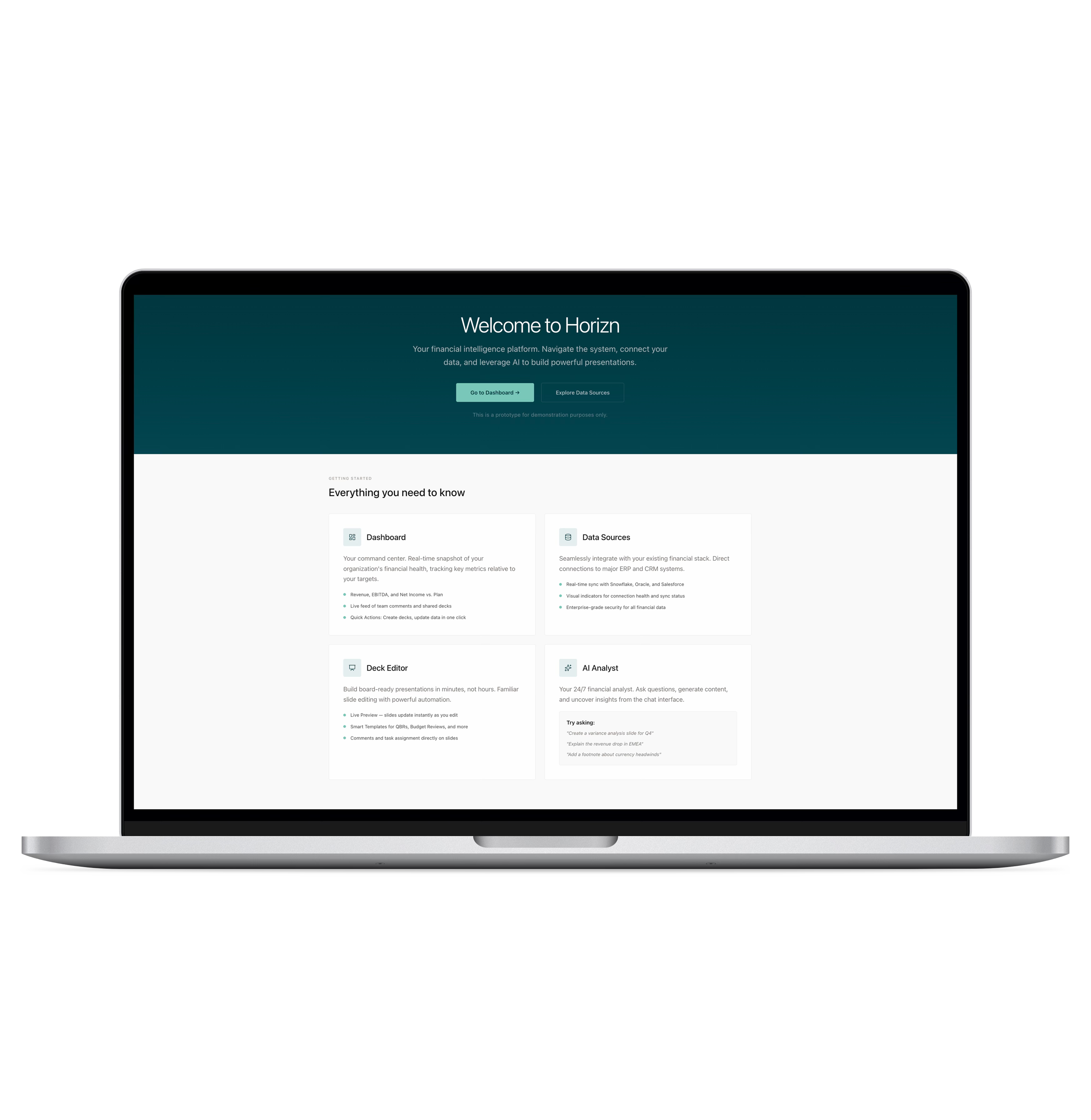
A spec project turned deep exploration: designing an AI-powered financial intelligence platform while using AI tools to accelerate every phase of the design process.
Try the Prototype →
Finance teams spend 80% of their time copying data into PowerPoint. The workflow is fragmented across Snowflake, Excel, and slide tools — every handoff introduces risk, outdated numbers, and hours of rework.
A functional prototype and a case study in AI-assisted design — from synthetic research and bias-corrected personas through to a production-grade Next.js prototype.
This started as a design exercise for an interview — design an AI-powered platform for finance teams building board presentations. I took the brief further during an AI in UX course, using it to explore how AI tools could accelerate every phase of design, from research through prototyping.
Without access to finance teams for primary research, I used AI tools to build a synthetic research foundation, then critically evaluated the outputs for bias.
Mapped direct competitors — Blueflame AI, Samaya AI, Rogo — and the broader finance AI landscape. Key finding: most tools were still chat-centric. No single product connected data ingestion, analysis, and presentation end-to-end.
Three gaps emerged: no tool connected all workflow stages, trust/data lineage was a prerequisite not a feature, and generic AI couldn't understand the financial narrative a CFO needs to tell.
I designed a 30-question survey targeting finance professionals, then used Gemini and Claude to generate 50 synthetic responses with realistic variation across roles, firm sizes, and experience levels.
Three personas emerged from the corrected data, each with explicit limitations: good for structuring research and brainstorming features, not for precise market sizing or external claims.
I mapped four core workflows as Mermaid diagrams. The AI content generation flow was the most critical — it shows how a user goes from asking a question to getting AI-generated content inserted into a slide with a full audit trail.
flowchart LR
    A["Select Slide\nwith Data"] --> B["Open AI\nAssistant"]
    B --> C{"Request Type"}
    C -->|"Explain Variance"| D["Build Prompt"]
    C -->|"Generate Content"| D
    C -->|"Rewrite/Edit"| D
    D --> E["Query\nSemantic Layer"]
    E --> F["Fetch Current &\nHistorical Metrics"]
    F --> G["Search Prior Decks\nfor Style Patterns"]
    G --> H["Generate Draft\nCommentary"]
    H --> I["Display Draft\nin Chat"]
    I --> J{"User Reviews"}
    J -->|"Accept"| K["Insert into\nSlide"]
    J -->|"Refine"| D
    J -->|"Reject"| L["Discard"]
    K --> M["Create Audit\nTrail Entry"]

    style A fill:#f5f5f0,stroke:#999,color:#111
    style D fill:#f5f5f0,stroke:#999,color:#111
    style H fill:#e8f5e9,stroke:#4caf50,color:#111
    style K fill:#e8f5e9,stroke:#4caf50,color:#111
    style M fill:#fff3e0,stroke:#ff9800,color:#111
AI Content Generation Flow — from user question to slide insertion with audit trail
The synthetic research and competitive analysis converged on four design goals:
Data must be live-bound to its source with visible connection health. No stale numbers, no manual refresh cycles.
AI assistance must understand the data, the deck, and the story being told — not just generate generic summaries.
The interface must feel professional for long focus sessions — CFOs spend hours preparing board decks. No visual noise.
Every number must be traceable back to its origin. Data lineage extends from the pipeline through AI-generated insights to the final slide.
The platform has three core screens, each solving a specific stage of the finance workflow.
Dashboard — real-time snapshot of financial health with direct paths to common tasks.
Quick Actions
Direct paths to the three most common tasks: creating a deck, updating data sources, and connecting new integrations.
Recent Presentations
Surface the most relevant decks with status indicators and one-click access to the editor.
Daily Data Brief
Alerts and new data notifications keep users aware of changes that impact their presentations.
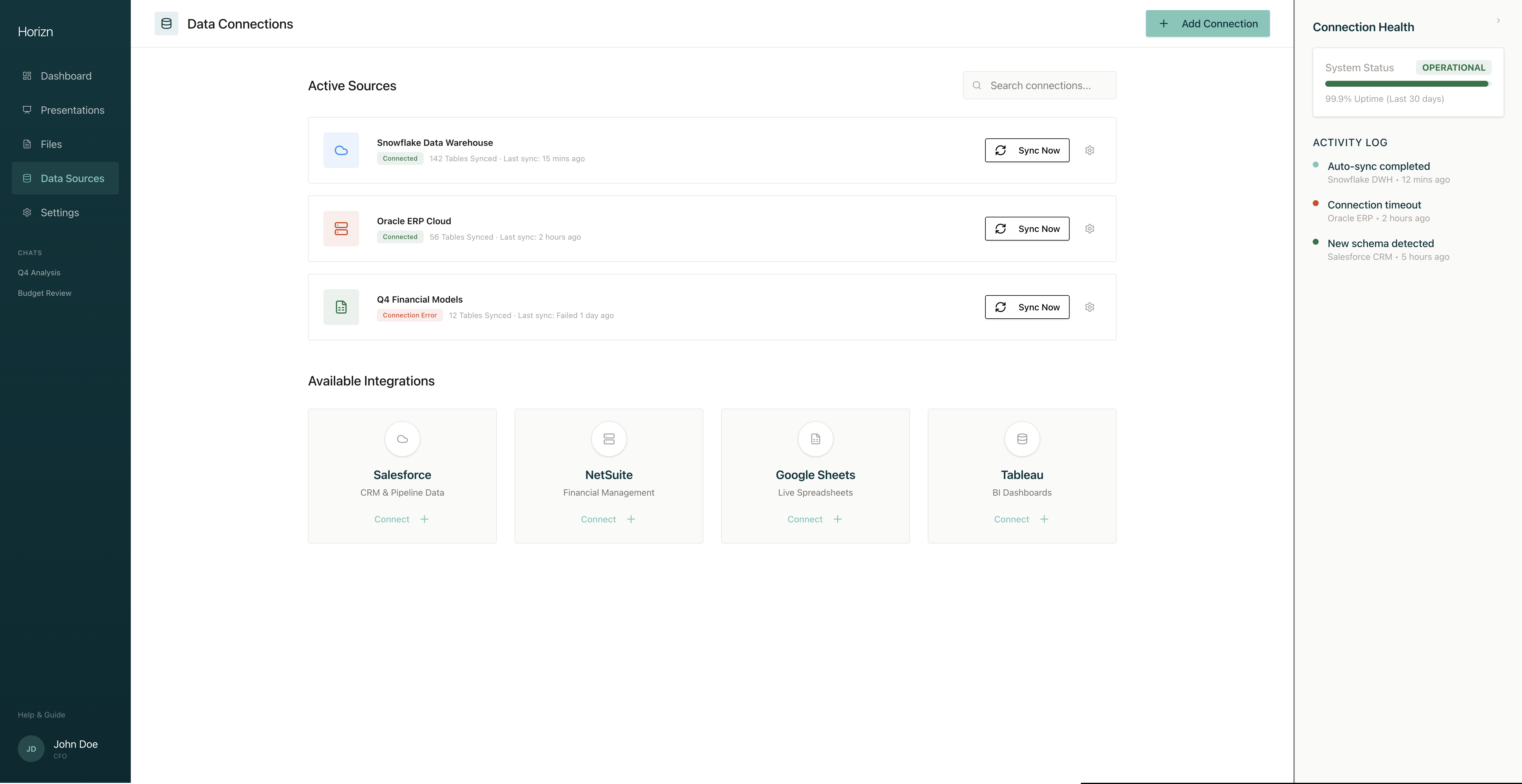
Data Sources — connection health visibility for every integration.
Connection Health
Real-time status for each integration (Snowflake, Oracle, Salesforce). Error badges with tooltips reveal exact error messages — nothing hidden.
One-Click Integration
New sources connect through a modal flow, removing the need for IT tickets. Available integrations show what's possible.
Activity Log
Real-time feed of sync events, errors, and schema changes — finance teams can't afford to discover a broken pipeline during a board presentation.
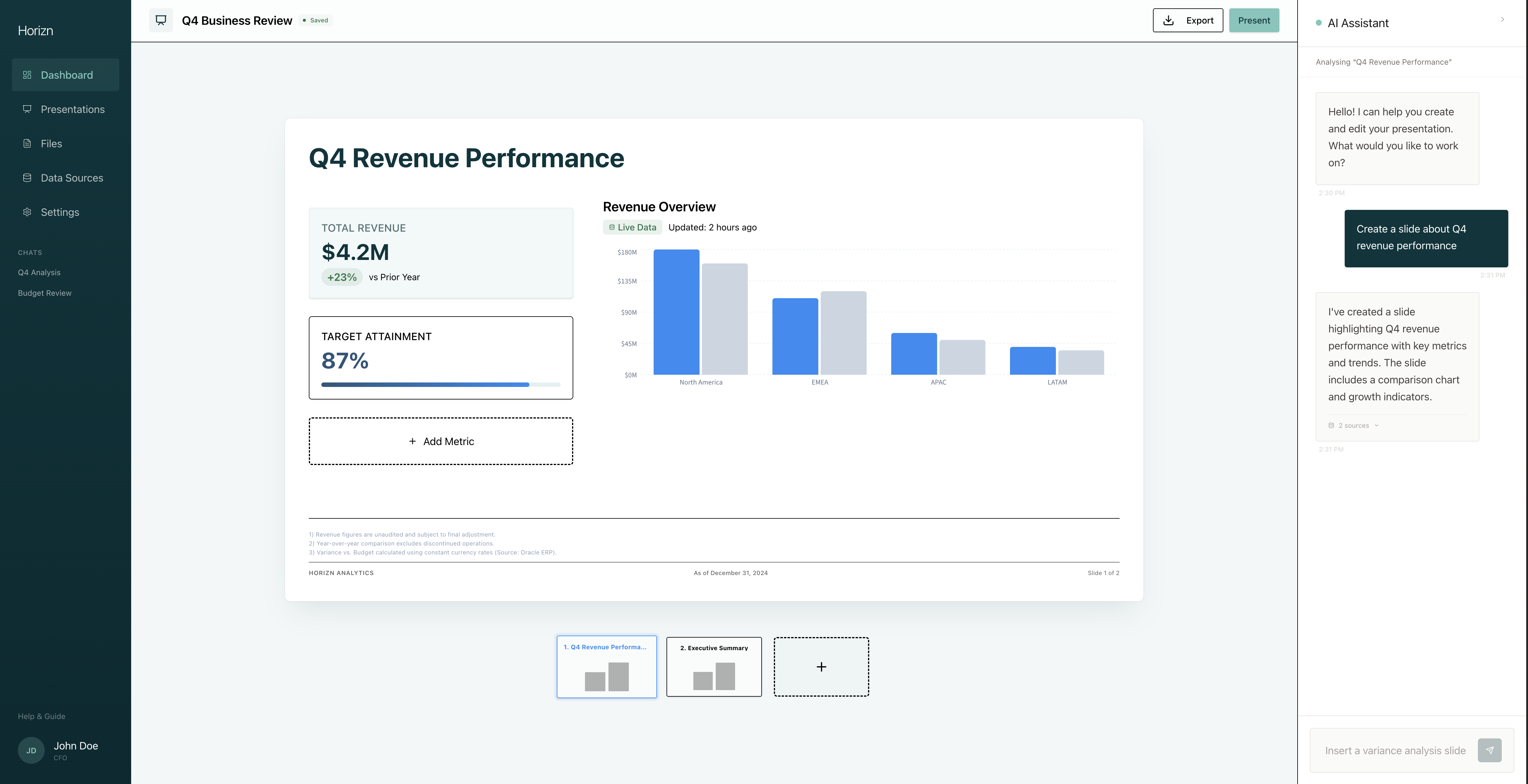
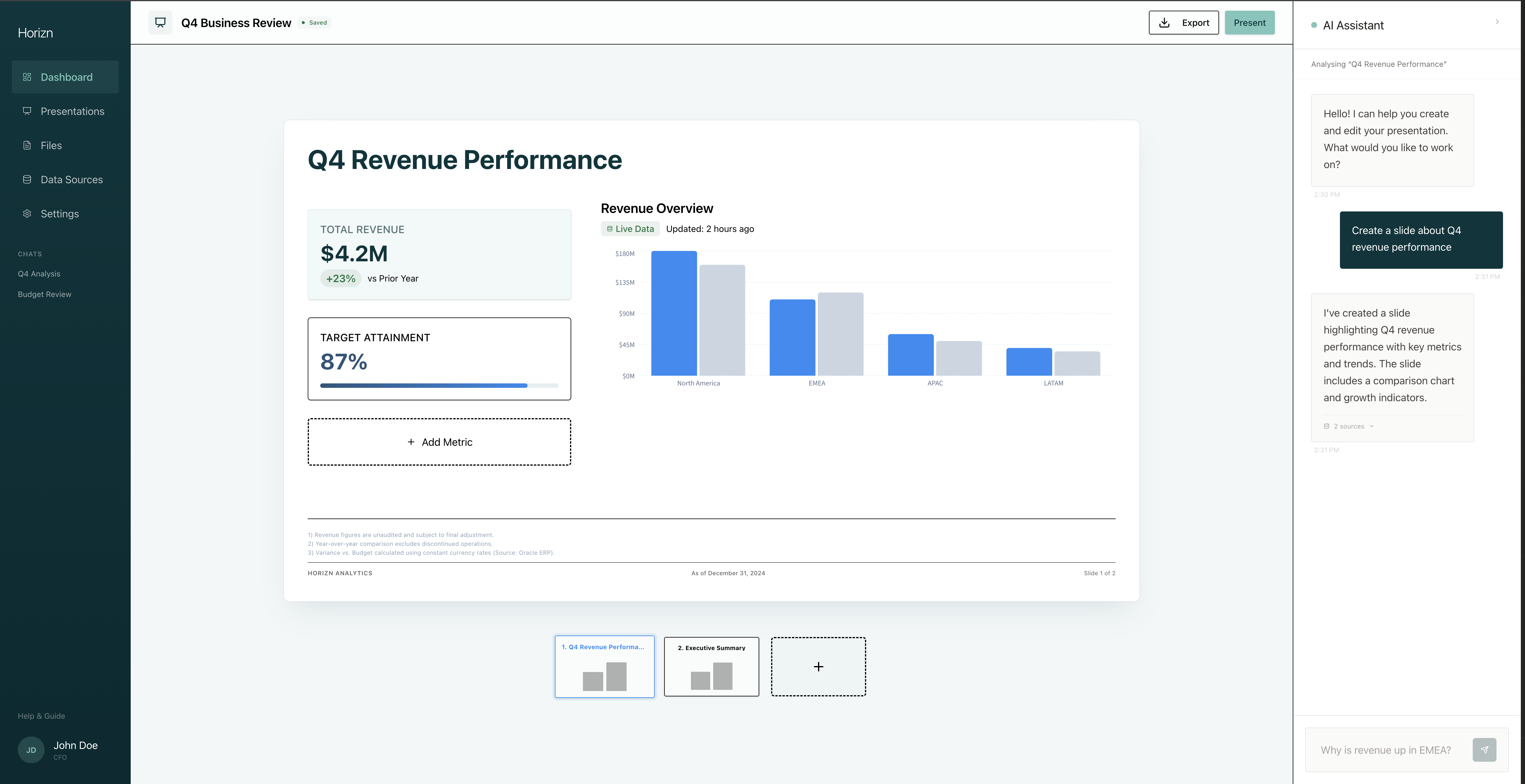
Deck Editor — the core of Horizn, where data, analysis, and presentation converge.
Three-Panel Layout
Slide thumbnails for navigation, a center canvas with live-bound charts, and an AI assistant panel — all visible without mode switching.
Contextual AI Assistant
Not a generic chatbot. It understands the data context. Ask "Why is revenue up?" and it offers to generate a Variance Analysis slide with data already populated.
Live Data Metrics
Charts and KPI cards are connected directly to the data source. Numbers update when the source syncs — no manual refresh.
This project was as much about exploring AI-assisted design as it was about the product itself. The design system was bootstrapped with MagicPatterns, then iterated through two major visual directions before landing on the warm stone palette.
| Phase | Tools | What they did |
|---|---|---|
| Market Research | Perplexity | Competitive analysis with sourced citations |
| Synthetic Research | Gemini, Claude | Survey response generation, analysis reports |
| Persona Development | Claude, NotebookLM | Bias-corrected personas, presentation decks |
| User Flows | Mermaid.js | 4 detailed workflow diagrams |
| Wireframes | HTML/CSS | 7 interactive wireframes |
| Design System | MagicPatterns | Initial component library bootstrap |
| Prototype | Next.js, Tailwind, shadcn/UI | Functional high-fidelity prototype |
| Usability Prep | Claude | Test script (not yet run with participants) |
The design system went through two major iterations. V1 (originally called "Farsight") used Deep Forest (#01353C) backgrounds with Bright Blue accents — enterprise-grade but too heavy for long sessions. V2 (renamed to Horizn) landed on warm stone neutrals with Sage green CTAs and Bright Blue reserved for data visualization.
Delivered a functional prototype covering all core workflows: dashboard monitoring, data source management, AI-assisted deck creation, and presentation editing. Built with Next.js, Tailwind CSS, and shadcn/UI — production-grade technology choices that could scale beyond the prototype phase.
Data lineage extends beyond the pipeline to AI-generated insights and slides. Without transparency into where an answer came from, finance users won't adopt.
Early iterations with dark themes and bold gradients didn't work for extended use. The warm stone palette came from designing for someone who spends three hours preparing a board deck.
Getting data into a system is a solved problem. Getting it out as a polished, narrative-driven presentation is where the real product value lives.
AI-generated survey data surfaced useful patterns, but the bias correction pass — questioning the data's assumptions — produced more realistic personas than the raw outputs ever could.
AI tools were most valuable when I challenged their outputs. The competitive analysis from Perplexity was well-sourced. The synthetic survey data needed significant correction.
The biggest risk with AI-generated research is that it looks authoritative. Being explicit about what's synthetic and what it can't be used for isn't just ethical — it makes the work stronger.