← Back to Work
Enterprise Workflow Data

Project Simplify

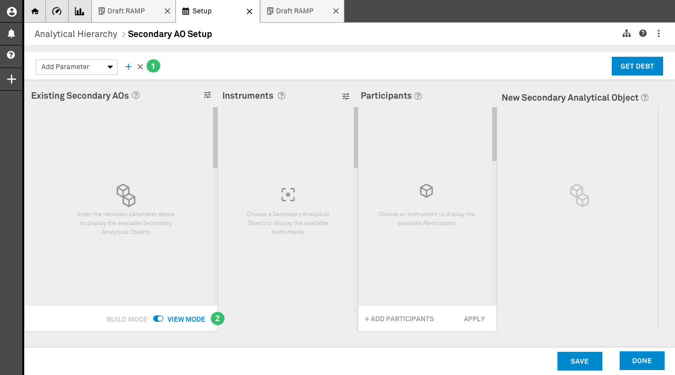
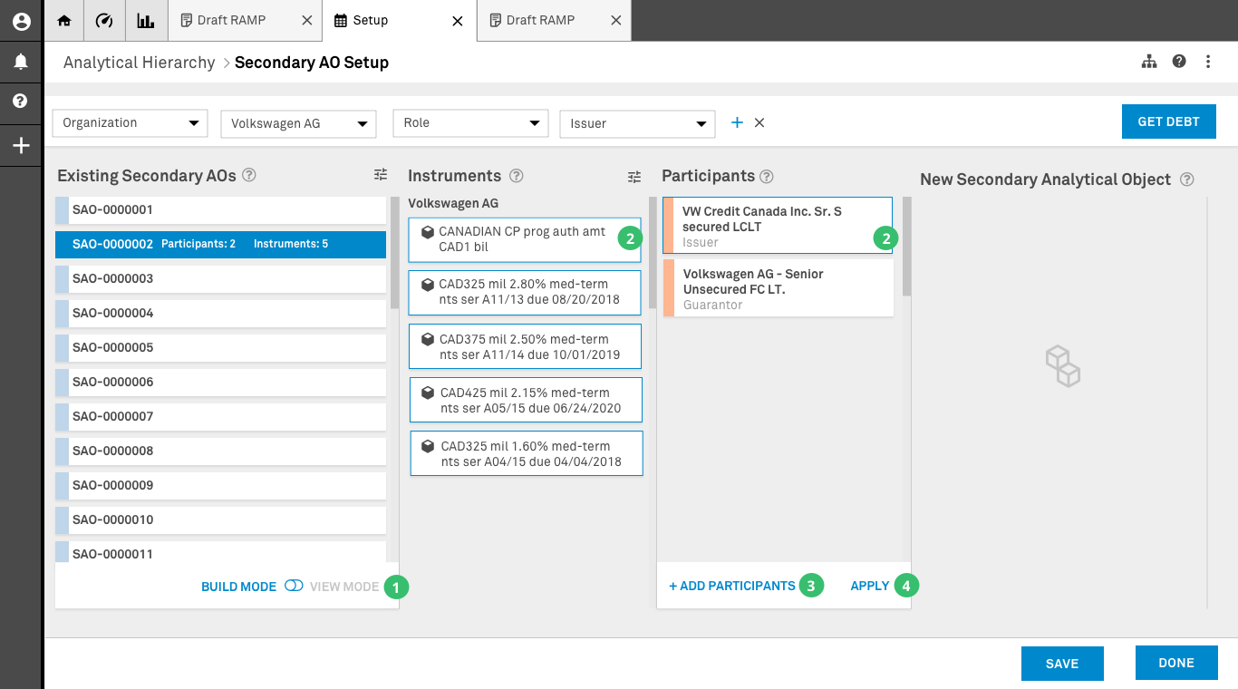
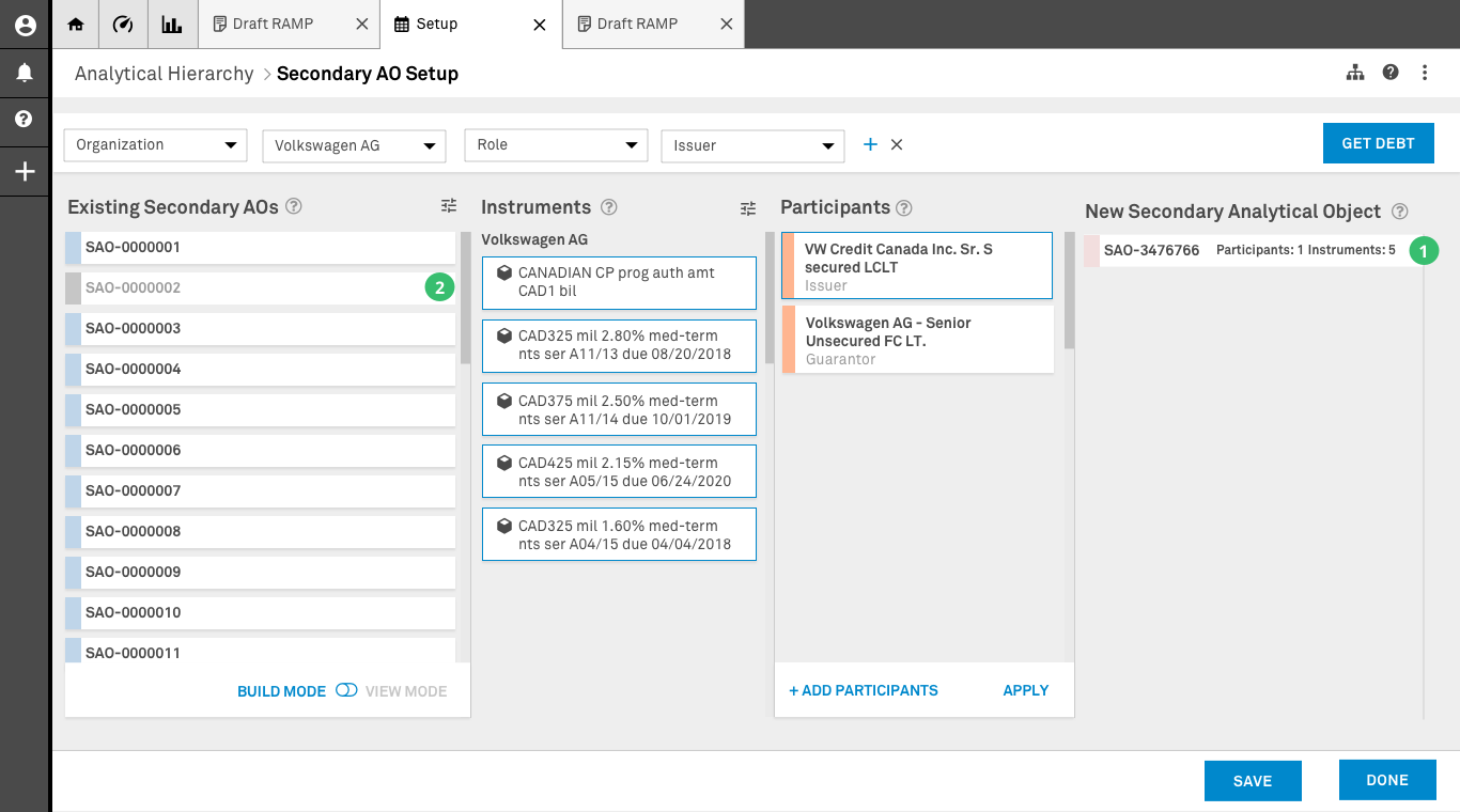
Internal technology initiative to provide analysts with a simpler, standardized ratings process — joining a project running two years behind schedule and redesigning the interaction design for the workflow platform.

Role Principal Product/UX Designer
Team Cross-functional
Platform Web (PEGA)
S&P Global Project Simplify — Secondary AO Setup in View Mode
The Problem

Multiple legacy systems cobbled together for analysts to work through their ratings process. The approach was inconsistent, hard to control, and detrimental to analysts' quality of life. The project was two years behind schedule.

The Outcome

A parameter-first design approach that worked within PEGA's constraints — and ultimately surfaced a strategic technology decision at the C-suite level about the company's entire tech stack.

01 Discovery & Context

S&P Global Ratings is the world's leading provider of credit ratings — opinions about credit risk that analyze the ability and willingness of an issuer (corporation, state, city government) to meet its financial obligations. These ratings inform investment and business decisions among market participants worldwide.

Create/Edit Primary Analytical Object — process flow

At S&P Global, issuers are called Primary Analytical Objects (PAOs). Their debt instruments — bonds, notes, securities — are Secondary Analytical Objects (SAOs). Creating and managing the relationships between these objects is core to the ratings process.

Create/Edit Secondary Analytical Object — process flow

Project Simplify was an internal initiative to replace multiple legacy systems with a single workflow platform built on PEGA. Three objectives: increase automation, reduce controls liability on analysts, and enhance talent development. When I joined as a consultant, the project was running two years behind schedule.

Project Status

The first design iterations revolved around massive grids inspired by analysts' existing Excel workflows — intended to display all entities, debt issues, participants, and dependencies. But the data sets were in the millions, and the grid concept presented a massive technology roadblock on PEGA.

My Role

I was tasked with leading the design for creating Secondary Analytical Objects. I advocated for and established design direction, designed core concepts and patterns for other designers to build on, and facilitated design sessions with business analysts.

02 Definition & Direction

The first design iterations revolved around a massive grid allowing analysts to view all entities, debt issues, participants, and dependencies — inspired by the Excel spreadsheets they already used.

Original grid-based SAO creation — the approach that failed

The original grid approach — millions of data points made this concept a technology roadblock on PEGA.

1

Technology Constraint

The grid couldn't support displaying millions of data points without crashing the application. The PEGA platform had restricted data displayable on screen simultaneously and extended processing times for external data.

Teams ended up siloed — solving things differently because the workflow designs didn't consider the Analytical Objects users would interact with at each step. I recognized the need for a fundamental change in design direction.

Key Decision

The proposed designs used existing design system components to reduce development and integration time — critical for a project already two years behind schedule.

03 Ideation & Design

I proposed a fundamentally different approach: instead of showing everything at once, use a Parameter Bar for initial data filtering, then progressive disclosure to surface relevant information at each step of the SAO creation process.

Empty state — Parameter Bar and four columns

After creating primary analytical objects, users create secondary analytical objects and build the relationships necessary to complete the analysis.

1

Parameter Bar

Users select different system parameters to perform initial data filtering — tackling the data loading limitations of the application.

2

Build/View Mode

Two modes of interaction. In Build mode users create new relationships. In View mode users access existing data without making changes — effectively validating data once saved.

View Mode — browsing existing SAO relationships

Data populated using the parameters selected by the user. The user is operating in View Mode.

1

Existing SAO Container

Displays a condensed view of all existing relationships without crashing the application. When an item is selected, the system displays contained elements in the corresponding columns (Instruments and Participants).

Build Mode — creating new SAO relationships

Data populated using the parameters selected by the user. The user is operating in Build Mode.

1

Build Mode

The user switches to Build Mode, enabling elements in columns two and three to be selected. This mode allows creating new relationships using the existing SAO as a starting point.

2

Selection

The user selects components of the existing SAO to create a new relationship. Once submitted, the system creates a new SAO and modifies the old one based on proprietary rules.

3

Add Participants

If a participant isn't present, the user can add them without affecting the search parameters. Only activated in Build mode.

4

Apply (Validation)

Once all instruments and participants are selected, the Apply option creates a new secondary AO. Saves a front-end only version initially — only activated in Build mode.

New Secondary Analytical Object created

New Secondary Analytical Object Creation.

1

New SAO

A new Secondary Analytical Object has been created. In View mode, selecting this card updates columns two and three to reflect the elements inside this new SAO.

2

Existing SAO

If the new SAO invalidates data in the existing SAO after cross-referencing, the existing SAO is greyed out — giving the user a visual sense of completed work.

Design Principle

Progressive disclosure over data dumps — instead of showing analysts everything at once (which caused confusion and crashed the application), the design surfaced relevant information at each step of the creation process.

04 Delivery & Reflection

The redesigned platform supported the product's transition from proof of concept to production. The interaction design for Analytical Objects, Workflows, and Scorecard established patterns that the broader design team could build on — core concepts that scaled across the application.

The design solution worked within PEGA's constraints — but presenting it surfaced a bigger question. Once leadership saw a viable design that actually worked within the platform's limitations, it triggered C-suite conversations about whether to move forward with the existing technology or invest in a stack that could support the complex grid analysts originally wanted. The design work had reframed a UX problem into a strategic technology decision.

This is a clear example of how design solves business problems: the work didn't just improve a product, it informed a strategic decision about the company's technology direction.

Solution Components

Analytical Objects

Redesigned the creation and management of Primary and Secondary Analytical Objects — the foundation for all downstream ratings work in the application.

Workflows

Master workflow connecting Analytical Objects to process steps — providing a scalable canvas that showed the big picture and unsiloed previously disconnected teams.

Scorecard

Redesigned from HTML tables to a navigable interface with left panel showing factors, sub-factors, scores, and final rating — managing complexity through information hierarchy.

Key Learnings

Design direction changes course

Recognizing that siloed teams were solving things differently, a master workflow connecting concepts gave the team a shared canvas and unblocked a two-year stall.

Complexity needs navigation

The Scorecard redesign proved that left panel navigation could manage deep complexity — factors, sub-factors, and scores — where HTML tables had failed.

Design exposes business decisions

A viable design within platform constraints made the technology gap visible to leadership — triggering C-suite conversations about the tech stack and reframing a UX problem into a strategic decision.

Next Project
Invoice Manager — Wells Fargo